Alternative Process Tutorials
Alternative Process Tutorial #6
Zone System, Part #2
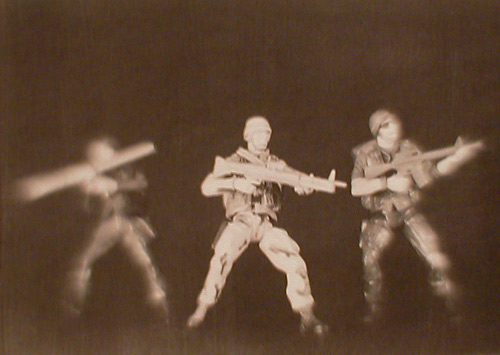
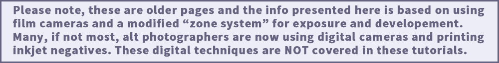
Illustration #57: Kallitype Photograph
Copyright © 2000 by Tom Ferguson
Click on image for larger view
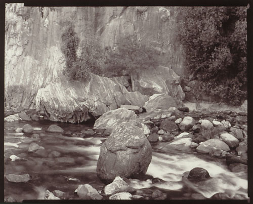
Illustration #58: Palladium Photograph
Copyright © 1994 by Tom Ferguson
Click on image for larger view
In tutorial #1, I wrote "The zone system was created by Ansel Adams and Fred Archer to bring sensitometry out of the laboratory and into the camera bag". They did this by dividing the range of brightness values in 11 "zones", numbered zero to ten. They made each of these "zones" double the brightness of the zone before it. This means that the zones are one full camera f-stop or shutter speed apart, and thus easy for photographers to use. Zone 0 is black in the real world and clear on film, zone 10 is white in the real world and black on film.
This range of 11 zones allows the system to correctly match the abilities of silver gelatin paper (typical modern black and white photo paper). Because each alternative process paper has different abilities, you should not use zones 0, 1, or 9, 10 for alternative process zone system work. Some processes will have more than 11 zones (palladium) and some less (cyanotype).
The classic Ansel Adams zone system definitions are quoted below (from "An Ansel Adams Guide: Basic Techniques of Photography " ISBN 0-8212-1882-4). The zones that do not apply directly to alternative process printing are in yellow:
Low values:
Zone 0: Total black in print. No useful density in the negative other than base plus fog.
Zone I: Effective threshold. First step above complete black in print, with slight tonality but no texture.
Zone II: First suggestion of texture. Deep tonalities, representing darkest part of image where some slight detail is required.
Zone III: Average dark materials and low values showing adequate texture.
Mid values:
Zone IV: Average dark foliage, dark stone, or landscape shadow. Normal shadow value for Caucasian skin in sunlight.
Zone V: Middle gray (18% reflectance). Clear north sky near sea level as rendered by panchromatic film, dark skin, gray stone,
average weathered wood.
Zone VI: Average Caucasian skin value in sunlight or artificial light. Light stone, shadows on snow in sunlit landscapes.
High values:
Zone VII: Very light skin, light-gray objects; average snow with acute sidelighting.
Zone VIII: White with texture and delicate values; textured snow; highlights on Caucasian skin.
Zone IX: White without texture approaching pure white, thus comparable to zone I in it's slight tonality
without texture. Snow in flat sunlight.
Zone X: Pure white of the printing-paper base; specular glare or light sources in the picture area.
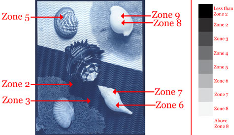
Illustration #59: Zone Placements
Copyright © 2001 by Tom Ferguson
NOTE: Computer monitors andcalibration settings vary greatly.
Consider the descriptions in the text more important than the above image!
Using these f-stop related zones we can meter a real world scene and visualize how it will look in monochrome. For example, metering a scene with a chair and its shadow next to a very bright lamp, we can measure how much darker the shadow is than the chair, and if a lamp will print or if it is "blown out".
We can use this same system of zones to measure our negatives to determine if they have enough exposure to print shadows as nicely separated tones or "mush", and enough density range to print well in an alt process.
We will use either a handheld "spot meter" or a camera with a spot meter mode in these tutorials. The term "spot" means that only a small area (spot) of the image is actually measured. This allows us to precisely measure different parts of a scene or negative. Many cameras also have "average" or "matrix" metering modes. These attempt to read an entire scene and guess at a correct exposure. These modes are not useful in zone system work.
Zone 5 is what most meters are calibrated too. Zone 5 is a middle gray (see illustration #59). This means that a camera meter aimed at a white wall will under expose your film to give a middle gray negative. A camera meter aimed at a black wall will over expose your film to give a middle gray negative. Knowing how to modify the reading a meter gives you, in order to put the value you want onto the film, is the heart of the zone system.
Zone 4 is one stop darker than the zone 5 meter reading (faster shutter speed or smaller aperture). Zone 3 is two stops below. Zone 2 is three stops below. Zone 2 is the darkest real world value which should record enough "detail" in a negative to print as a "black with a touch of detail" in a print. Zone 6 is one stop brighter than the zone 5 meter reading (slower shutter speed or larger aperture). Zone 7 is two stops above. Zone 8 is three stops above. Zone 8 is the brightest real world value which should record (and be developed for) enough "detail" in a negative to print as a "white with a touch of detail".
Notice that the definition for zones 2 and 8 are very similar. They are the extremes of tone with detail. Zone 2 is as dark as you can go and still see detail in the shadows. Anything darker than zone 2 is just a black tone that you can see no detail in. Zone 8 is as bright as you can go and still see detail in the highlights. Anything brighter than zone 8 is simply white tone, or plain paper, without detail. These two "edge of detail" tones, zones 2 and 8, will be used in most of our calibration processes.
Look at illustration #59 and I'll explain how the zone system was used to make this image. I tend to measure the highlight first, so I metered the brightest part of the scene I wanted detail in. This was the top of the upper right shell, and is labeled as "zone 8" in the illustration. My meter read 1/4 second at F64. Remember that most meters are calibrated to make everything zone 5. If I had exposed at this reading my bright shell would be zone 5 (middle gray), and everything else in the image even darker. My shadows would have been so underexposed that they would not have been be printable. I wanted the top of that shell to be zone 8 (very light gray/white with a touch of detail). Zone 8 is 3 zones, and thus three stops, brighter than a meter reading. Because of this I set the camera to 3 stops more than the meter said, from the meter reading of 1/4 second at F64 to a camera setting of 1/4 second at F22.
I then measured the darkest part of the scene I wanted to hold some detail. This was the dark shadow under the spiny shell, labeled as zone 2 in the illustration. My meter reading was 1/4 second at F8. If I had exposed at this setting, the dark shadow would have been zone 5 (middle gray) and everything else would have been brighter than middle gray. My highlights would have been so overexposed that they would have lost separation on the film and printed very poorly. I wanted this shadow to be zone 2 (very dark gray/black with a touch of detail). Zone 2 is 3 zones, and thus three stops, darker than a meter reading. Subtracting three stops from the meter reading of 1/4 second at F8 gave me 1/4 second at F22.
Because that was the same setting I calculated from my zone 8 highlights, I knew the scene would fit onto the film and print correctly. I also metered other parts of the image, I checked the brighter parts of the lower right shell and got 1/4 second at F45. Because this was two stops brighter than my camera setting, I knew that it would print two zones brighter than zone 5. This zone 7 gray seemed appropriate for the scene.
I exposed the film at 1/4 second at F22, and because I had calibrated my development time to match my cyanotype paper (explained in tutorial #10) it was easy to make a print that matched my expectations.
Often you will find scenes with more or less contrast range than you aesthetically want. We will look at how to handle these scenes in tutorial #19.
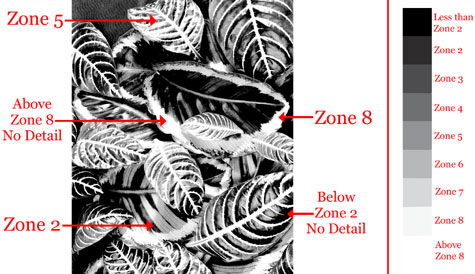
Illustration #60: Zone Placements
HIGH CONTRAST EXAMPLE
Detail in shadows and highlights are lost in print
Copyright © 2001 by Tom Ferguson
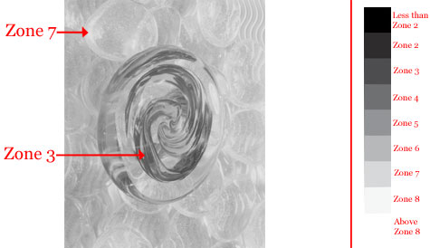
Illustration #60: Zone Placements
LOW CONTRAST EXAMPLE
Lacks graphic interest due to weak blacks and dull whites
Copyright © 2001 by Tom Ferguson
NOTE: Computer monitors and calibration settings vary greatly.
Consider the descriptions in the text more important than the
above images!
Click the "next" link below and I'll explain two methods of measuring your negatives. This will allow you to eliminate the "test strip" that we did in this tutorial and to determine before printing if your negative has the correct density range for a given process.